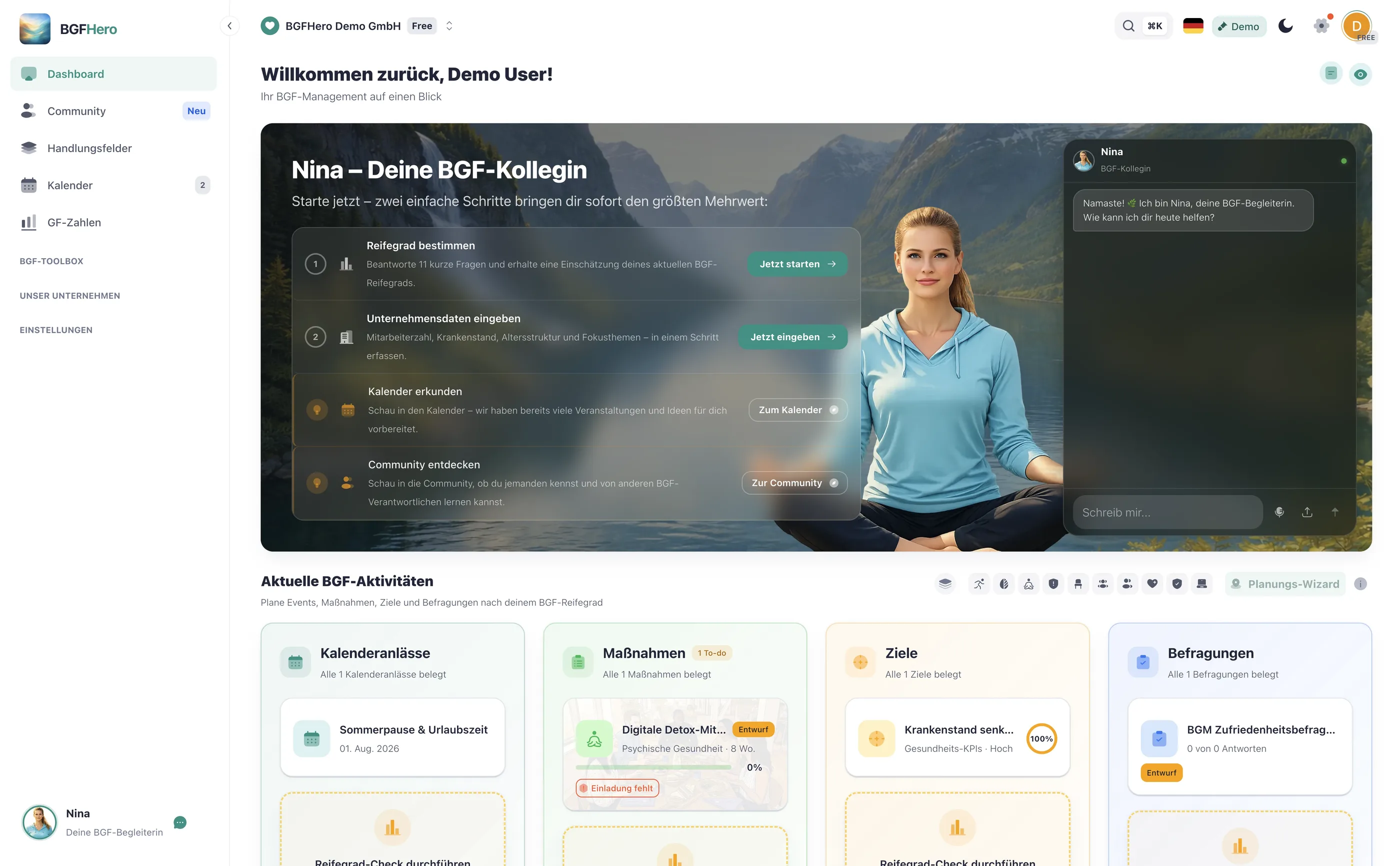
BGM Dashboard: All KPIs at a Glance for Leadership
Which KPIs a BGM dashboard really needs
Many BGM managers collect data across different tools and spreadsheets — sick leave here, participant numbers there, maturity level somewhere in a presentation. The problem: when data doesn't come together, the big picture stays unclear. A BGM dashboard brings the most important metrics into one place.
The five core KPIs that matter:
**1. Sick leave rate (%)** – The baseline metric of every BGM program. What matters isn't just the current value, but the trend: Is it declining? Are there seasonal spikes? The number only becomes truly meaningful when compared to the industry average.
**2. BGF score** – An aggregated assessment of ongoing measures: How many are active, what's the participation rate, how satisfied are participants? This score shows at a glance whether the BGF program is running or stagnating.
**3. BGM maturity level** – Where does the organization stand overall? Maturity level assesses structures, leadership culture, offerings, and effectiveness. It changes slowly — so a quarterly update is sufficient.
**4. Measure progress** – How many planned measures have been implemented, how many are in preparation, how many are stuck? This metric shows whether BGM is truly lived out day to day.
**5. Time investment** – How many hours flow into BGM per week or month? This figure helps justify resource allocation and identify bottlenecks early.
Optionally useful: employee satisfaction with BGM offerings (from pulse surveys) and reach (share of the workforce that has used at least one offering).
How to make the dashboard leadership-ready
A dashboard for yourself has different requirements than one for leadership. Leadership reports need to answer three questions: What does BGM cost? What does it deliver? And what comes next?
Here, less is more. Leaders don't need detailed data — they need traffic lights. Green means: on track. Yellow means: action needed. Red means: escalation required. If your dashboard maps these three states for the five core KPIs, you have everything a leadership presentation needs.
Two more elements make the difference: trends and comparisons. A sick leave rate of 5.2% says little on its own. The same value, three points below last year's figure and 0.8 points below the industry average, is a strong argument. Build this context directly into the dashboard — it saves you lengthy explanations in the report.
Also define a fixed reporting rhythm: a monthly update for yourself, a quarterly report for leadership. Anyone who reports ad hoc loses the thread.
EasyBGM: dashboard and leadership report from a single source
EasyBGM maps exactly this workflow. The dashboard shows sick leave rate, BGF score, maturity level, measure progress, and time investment in a single view — with trend arrows and industry comparison where available. You don't enter data manually; it's generated as a byproduct of your daily work in the tool.
For the leadership report, you export a polished overview with one click, summarizing traffic-light status and key trends on a single page. No Excel, no copy-paste, no formatting. The effort for a complete monthly report realistically comes to 15 minutes — if the data has been maintained continuously.
How to put it in place
- 1Open the BGM dashboard in EasyBGM: Open the dashboard in EasyBGM and get an initial overview of the metrics already available. Check which data already exists and where gaps remain.
- 2Define 5 core KPIs and check the data basis: Decide which five metrics are most relevant for your company. Absenteeism and measure progress are mandatory; BGF score, maturity level, and time investment round out the picture. Check for each KPI whether the data basis is complete.
- 3Add missing data once: Enter existing historical data — especially absenteeism over the last 12 months and already completed measures. This is a one-time effort and forms the basis for meaningful trends.
- 4Define the executive report rhythm: Decide when and in what format leadership will be informed about BGM metrics: monthly, quarterly, or as needed. Add the first reporting date to your calendar and create the export template in EasyBGM.
- 5Establish a dashboard routine: Reserve 15 minutes per week for dashboard maintenance: entering new measures, updating absenteeism data, adding notes on outliers. After four weeks, the routine runs on its own.
What you need
- Effort
- under 30 min
- Cost
- Free
- Duration
- 2 Wochen
- Setup
- 20 min
- ✓ All BGM metrics centralized in one place — no more searching across different spreadsheets and tools
- ✓ Executive reports in 15 minutes instead of several hours — a ready-made status view instead of manual formatting
- ✓ Trends made visible: absenteeism, measure progress, and BGF score comparable over time
- ✓ Justify resource use transparently — time investment and ROI at a glance for budget discussions
Adopt it for your company
One click — and the measure sits ready in your plan. Guided step by step, no lengthy setup.
ÜbernehmenZahlt ein auf
Handlungsfeld
Passender Anlass
Passende Best Practices
Nicht sicher, wo ihr anfangen sollt? Selbstcheck →